
This is the body field for your button. It is not required. Only text is allowed in a Button body field.
This is an optional section title
This is an optional section subtitle

Body
To see examples of the Big Buttons paragraph being used, visit the Big Buttons demo page.
-
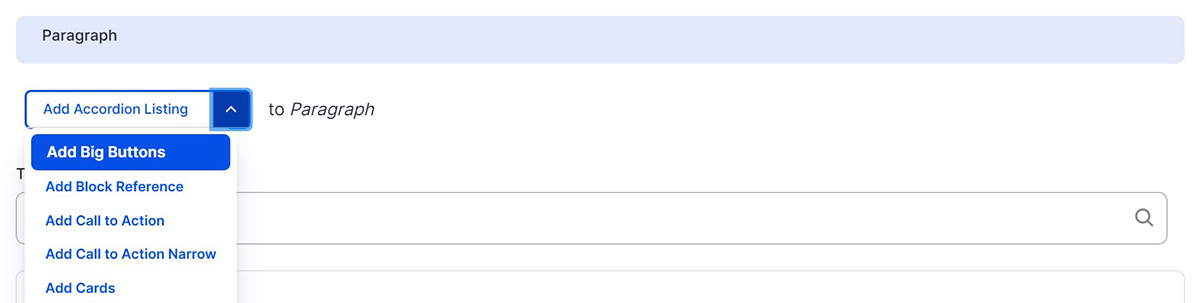
Select ‘Add Big Buttons’ from the Paragraphs dropdown
-
Select a color from the Card Background dropdown. Big Buttons can be either white or Illini Blue. Text and heading colors are set by the theme.
-
Select Left or Center from the Alignment dropdown. This will align your set of cards to the left or center them on the screen. This does not control the alignment of the text within the cards.
-
Select a layout option from the Layout dropdown. ‘Fixed Width’ means that the content will fit within the width of the page content. ‘Full Width' means that the content will extend to fill the entire width of the browser.
-
The Section Title and Section Subtitle fields are used to describe your set of Big Buttons. These fields are optional.
-
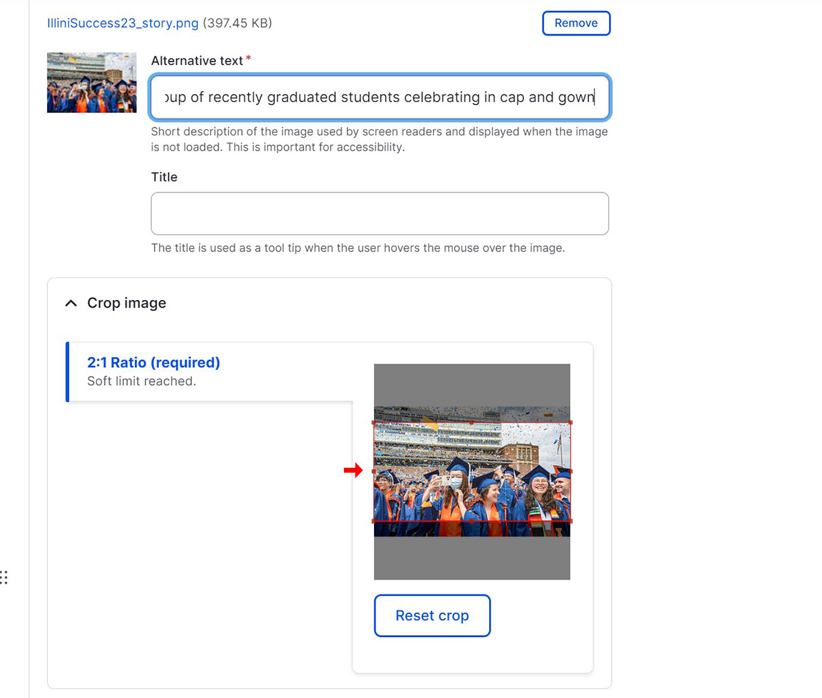
Under Big Buttons, upload an image. The image size is 2:3 ratio. Ideally 720 x 483 px. Add Alternative text to your image, this text should describe what the image is for screen readers. Next, you can adjust the position of the image crop or you can click on the image to keep the default crop
-
Add a Button Title
-
The Button Body is optional and should only contain text.
-
Add a Button Link. You can link to an internal page by typing the title, then selecting it when it autocompletes. To link to an external page, paste the entire URL into the Button Link field.
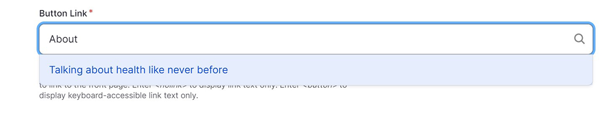
An example of the autocomplete field linking to an internal page.
-
To add additional Big Buttons to your set, click the ‘Add Big Buttons Content’ button. There is no limit on the number of Big Buttons you can have. However, they will automatically align to 3 buttons per row.