To see more examples of the Icon Row paragraph in action, visit the Icon Row demo page.
-
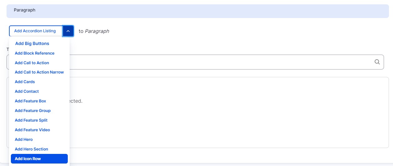
Select ‘Add Icon Row’ from the Paragraphs dropdown.
-
Select an option from the ‘Section Background’ dropdown. This will be the background color of your row.
-
Select an option from the ‘Icon Size’ dropdown. This option controls the size of all the icons within this row. You can choose Small or Large icons.
-
Add a Section Title (optional).
-
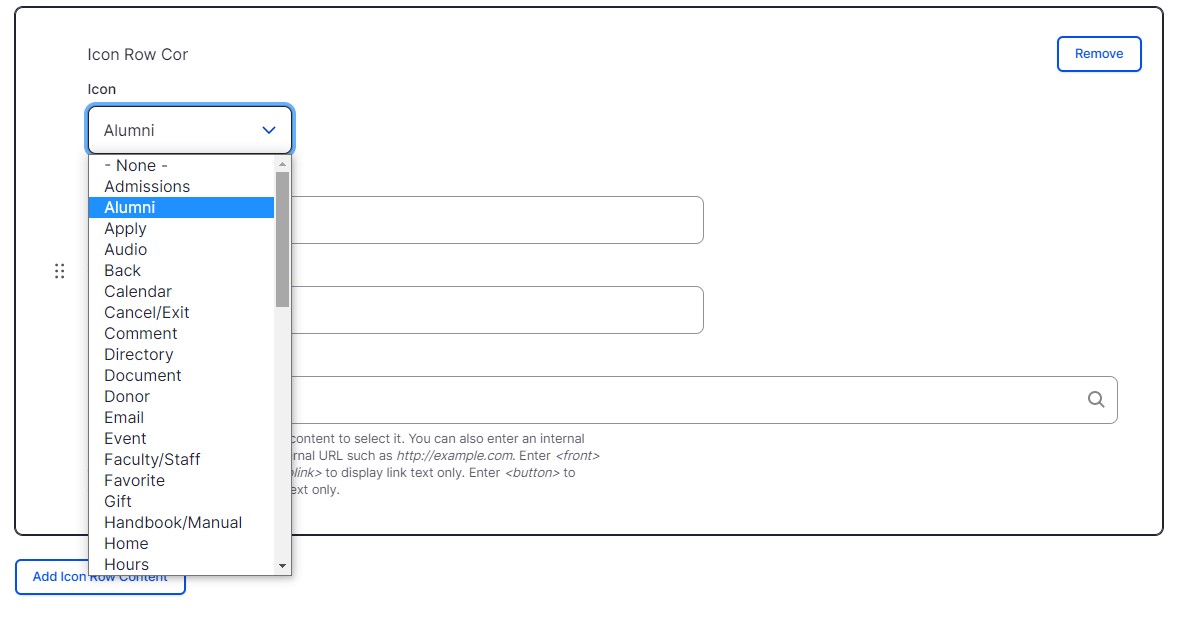
Under ‘Icon Row Content’ select an option from the ‘Icon’ dropdown. This list is a textual representation of all the icons available for use. If you would like to see a list of what each icon looks like, visit the Web Component Builder.
-
Add Callout text (optional). This text will be the headline that appears under your icon.
-
Add Text (optional). This text will be the text that appears under your icon.
-
Add a Link (optional). This URL will link to your text in the Text field.
-
To add additional Icons to your Icon Row, click the ‘Add Icon Row content’ button. A maximum of 8 icons can be added per Icon Row.