

To see more examples of the Cards paragraph in action, visit the Cards demo page.
-
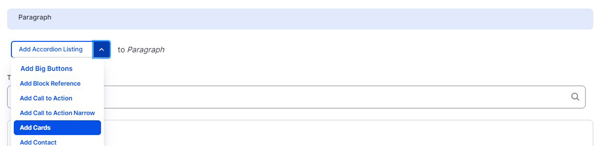
Select ‘Add Cards’ from the Paragraphs dropdown.
-
Select a color from the ‘Section Background’ dropdown. Cards can be either white or Illini Blue. Text and heading colors are set by the theme.
-
The Section Title and Section Subtitle fields are used to describe your set of Cards. These fields are optional.
-
Under Cards content, upload an image. The image size is 2:3 ratio. Ideally 720 x 483 px. Add Alternative text to your image, this text should describe what the image is for screen readers. The image field is optional, but best practice is to be consistent. All cards in a row should either have an image or not have an image.
-
Card Title is optional.
-
Card Body is optional and will only accept plain text.
-
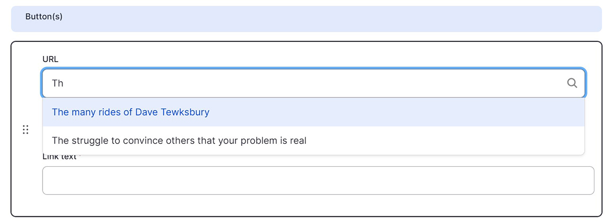
The button field is optional and you can only add one. Buttons require both a link and Link Text. You can link to an internal page by typing the title, then selecting it when it autocompletes. To link to an external page, paste the entire URL into the URL field.
-
To add additional Cards to your set, click the ‘Add Cards Content’ button. A maximum of three cards can be added per row.