A Hero is designed to be the first item on your page. They are typically used for homepage and landing page designs. To use a Hero, make sure ‘No Sidebar’ is selected in the dropdown under ‘Sidebar’. Do not add content to the Body field.
To see more examples of the Hero paragraph in action, visit the Hero demo page.
-
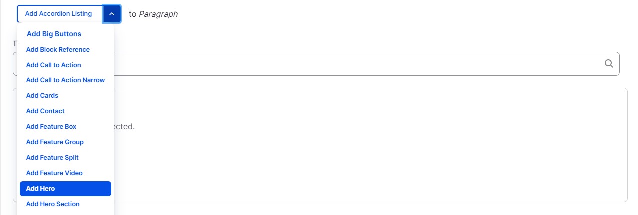
Select ‘Add Hero’ from the Paragraphs dropdown.
-
Select an option from the ‘Design’ dropdown. Options consist of a button theme and a background. Design with an Image for a background will need to have an image uploaded in the Image field. Blue and Orange backgrounds will consist of a solid color with coordinating buttons on top.
-
Select an option from the ‘Text and Button Alignment’ dropdown. This option will set the position of your title and button elements. To see examples of each alignment set, see the Web Components Preview.
-
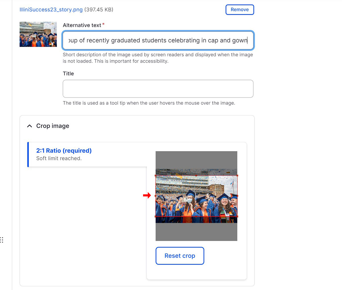
If you selected ‘Image with Orange Buttons’ or ‘Image with Blue Buttons’ from the Design dropdown, upload an image. Images must be larger than 1152x768 pixels. Keep in mind that the Hero image will extend across the entire width of your browser screen. Add Alternative text to your image, this text should describe what the image is for screen readers. Next, you can adjust the position of the image crop or you can click on the image to keep the default crop
-
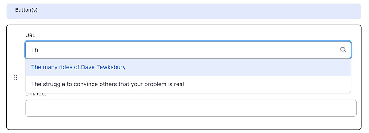
Buttons are optional and you can add up to three. Buttons require both a link and Link Text. You can link to an internal page by typing the title, then selecting it when it autocompletes. To link to an external page, paste the entire URL into the URL field.